Guide by Cesar · Updated October 2026
Wes Anderson settings, for Lightroom.
Wes Anderson's films are known for their color: soft pastels, golden light and teal skies, all framed dead center. Here are the Lightroom settings that get you close, what makes the look work, and eight presets that do it in one tap.
What makes it Wes Anderson
Pastel, golden and dead center.
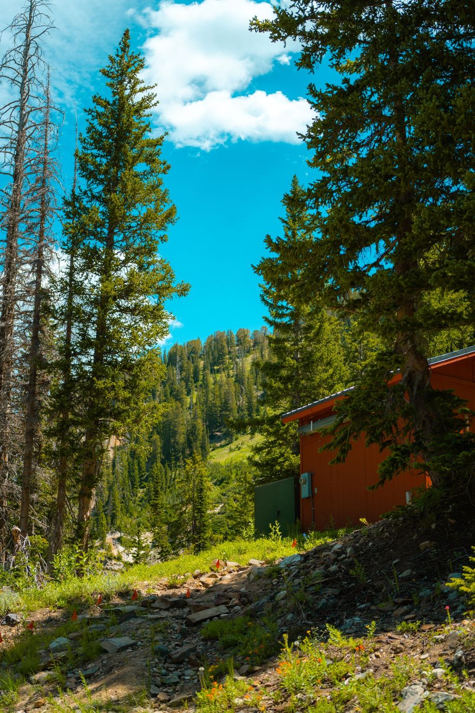
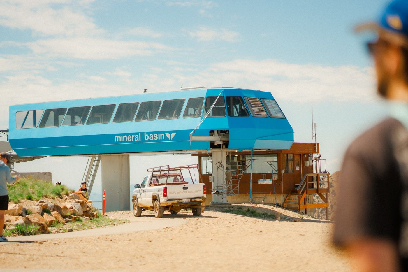
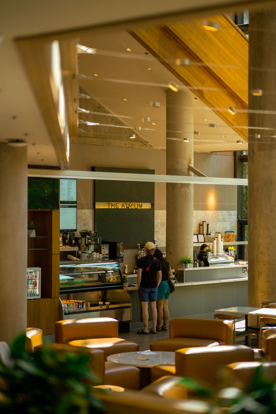
Most of his look is made before the shot, in the sets, the costumes and the framing. Color is the part Lightroom can help with. Four things give it away.
A short palette
Each film keeps to a few colors, like the pinks of The Grand Budapest Hotel or the yellows and khaki of Moonrise Kingdom. Fewer colors read as more designed.
Soft, warm light
Contrast stays low, shadows stay open and highlights lean golden, so even a plain afternoon feels like a storybook.
Teal skies, cream whites
Blues drift toward teal and whites toward cream. Next to warm yellows and reds, that pairing is most of the look.
Everything centered
No slider does this one. Stand square to your subject, put it in the middle of the frame and keep the horizon level.
The settings
Six steps in Lightroom.
Each step shows the panel it happens in, set to my starting numbers. Every photo starts from different light, so adjust to taste. In Classic, the same sliders are in Basic, Tone Curve, HSL and Color Grading.
1. Warm it up
In Color, move Temp a little warmer and Tint a little toward magenta, so whites turn cream and skin looks rosy.
ColorWhite Balance
2. Soften the light
In Light, lower Contrast and Highlights and raise Shadows, so nothing gets too dark or too bright.
Light
3. Lift the blacks
In the curve, drag the bottom-left point up, so the darkest parts turn a soft gray. That fade is what makes color feel pastel.
Curvein Light
4. Shape the palette
In the Color Mixer, shift Yellow toward orange and give it a little more saturation. Then shift Aqua and Blue toward teal.
Color Mixerin Color
Yellow
Aqua
Blue
5. Grade the light
In Color Grading, add a little gold to the highlights and a little teal to the shadows. Keep both subtle.
Color Gradingin Color
Shadows
Hue 190 · Sat 10
Highlights
Hue 45 · Sat 12
6. Save it as a preset
In Presets, open the three dots menu and choose Create Preset, so the next photo takes one tap.
Presets
The shortcut
Or one tap, with Wes Anderson II.
My Wes Anderson II pack has eight takes on the look, each named after one of his films. Fox Tracks is bright and airy, Chevalier Sunrise deepens blue skies and Rushmore Gold warms up cafés and indoor light.
They're one-click presets for Lightroom on your phone, desktop or Classic. Pick a look, then adjust exposure or white balance to taste.
Questions
Good to know before you start.
Are these from Wes Anderson's films?
No. They're my own looks, inspired by the color in his films. Sombra isn't connected to or endorsed by Wes Anderson or his studios.
Wes Anderson or Wes Anderson II?
The first pack has two looks, Budapest and Anderson 400, for bold, bright color, and costs $9.95. II has eight, with more golden light and a look for each kind of scene. Here's the first pack.
Do the presets work on phone photos?
Yes, in the free Lightroom mobile app. They work on the phone's regular photos and on raw ones.
Why doesn't my photo look like a film still?
Most of his look is set before the camera rolls: painted walls, costumes and a centered frame. Color sets the mood. Finding a pastel wall and standing straight in front of it does the rest.